Google's Clock and Pixel Magnifier apps have been updated with stylish icon redesigns, enhancing their visual appeal while keeping functionality intact.
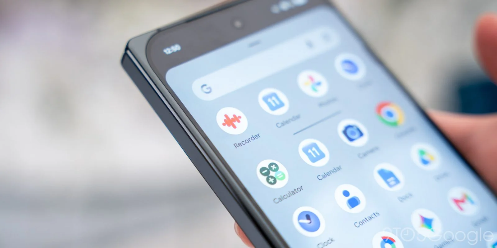
Google recently unveiled a new icon design for its Clock app, coinciding with the launch of the Pixel 11. The Pixel Magnifier also received a similar visual refresh.
Icon Redesign Details
The revamped Google Clock icon takes inspiration from the aesthetic of Pixel Watch faces, featuring bold, pill-shaped hands for the hour and minute indicators. The blue face now sports a gradient and is set against a clean white background, a design trend seen in many of Google's applications.
This design choice reflects a broader shift within Google to unify its app interfaces under a sleek, modern aesthetic. By adopting a gradient color scheme and pill-shaped features, Google aligns itself with design sensibilities that prioritize simplicity and minimalism. Such changes aren't just cosmetic; they communicate a brand ethos that resonates with a younger audience increasingly drawn to modern user interfaces.
Interestingly, Chrome stands apart as a notable exception to this trend, maintaining its distinct look despite being a larger app. Its icon is also nestled within a rounded square on macOS, making it unique among its peers. This divergence poses an interesting question about brand identity. While consistency in design across apps can enhance user recognition, Chrome's retention of its iconic look signifies a calculated risk in maintaining a recognizable brand amidst broader visual changes.
Comparative Icon Representation
Old vs. new
The updated icon shows the clock hands positioned at 9:10, with an additional dot at the 30-minute mark. This subtle choice isn't arbitrary; in design, particular times can evoke certain feelings or thoughts. A clock showing 9:10 often represents a moment frozen in time—just before something significant happens, injecting a narrative element into the icon that’s usually overlooked.
Minor tweaks have also been applied to the app shortcuts; the functionality is now described as “Create alarm/timer” instead of the previous “New alarm/timer.” Such changes might seem trivial, but they demonstrate a thoughtful approach to language that aims to improve clarity and user experience. Subtle shifts in terminology can significantly impact how users interact with features, making them feel more intuitive. Notably, the internal interface of the Clock app remains unchanged. You can’t help but wonder: what would a full overhaul of the interface look like, given these attractive new visuals?
Google Clock version 9.1 is now officially available through the Play Store. There’s something to be said about how such incremental updates can keep a long-standing app feeling fresh and relevant.
Pixel Magnifier Update
On the same day, Google rolled out Pixel Magnifier version 2.0.0.965719431, accompanied by a new icon design. Similar to the Thermometer application, the updated icon features a thicker magnifying glass with a gradient background, moving away from the previous blue hue. This design decision reflects a greater emphasis on accessibility and ease of use. A thicker magnifying glass implies sturdiness and makes the icon more visually distinguishable, which enhances its functionality.
Additionally, the Quick Settings Tile icon has been redesigned to align with this fresh visual identity. However, the app's interface itself has not seen any modifications. This raises questions about Google's commitment to the accessibility category. While a visual refresh does modernize the experience, substantive updates to the interface could genuinely impact usability for those relying on accessibility tools. Some users may feel the incremental visual changes don't meet their expectations for a comprehensive update.
Visual Comparisons


Implications and Future Outlook
These updates might seem minor in isolation, but they hint at a larger narrative about Google's direction. A fresh coat of paint on user interfaces suggests that Google is cognizant of maintaining relevance in a competitive tech ecosystem while working to solidify its brand identity. Design matters; it's not only about how things look but also about how they feel to use.
If you're working in this space, watching how user interface consistency affects user retention can be telling. It’s a balancing act: too much change can alienate long-time users, while too little can make products feel stale. Google's efforts appear calibrated to meet both demands, but only time will tell if this strategy proves successful.
In summary, these changes may indicate Google's strategy to harmonize its apps while ensuring that individual products maintain their unique identities. But will it lead to greater user engagement—or will it remain just an aesthetic update? Only user feedback will ultimately shed light on that. (And this is the part most people overlook.) If Google's markets take these updates well, we could see similar visual refreshes across even more apps in the future, hinting at a more cohesive visual brand language. But for now, we'll have to wait and see.
Discussion
Sign in to join the discussion.